Room Layout Basics: Arrange Furniture Like a Designer
If your living room feels a little "off" but you can't say why, the problem is usually the layout, not the furniture. This guide walks through the same handful of rules designers use to arrange a room — focal points, conversation zones, traffic flow, and visual balance — in plain language you can act on this weekend. It's written for renters and homeowners alike, whether you're setting up a studio apartment, a family living room, or a home office corner. No new furniture required; most of what follows is about where things go.
Start With the Focal Point
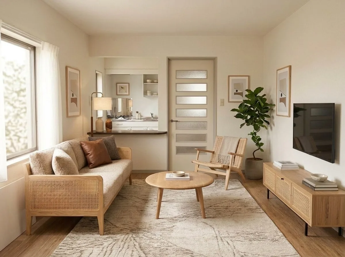
Every room needs one thing your eye lands on first. In a living room that's often a fireplace, a large window with a view, or a media wall. In a bedroom it's the bed. In a dining room it's the table. Decide on your focal point before you move a single piece of furniture, because everything else gets arranged in relation to it.
The most common furniture layout mistake is having two focal points fighting each other — for example, a fireplace on one wall and a TV on the wall opposite, so the sofa can't face both. Pick the one you actually use most (be honest: for many households that's the TV) and let it win. If your room genuinely has a beautiful architectural feature like a bay window, build around that and mount the TV nearby rather than on a competing wall.
Anchor the arrangement, then let it breathe
Once the focal point is set, place your largest piece first and angle it toward that point. In a living room the sofa faces the focal point; side chairs come in at an angle to close the group. This "anchor first" order keeps you from the trap of pushing every piece flat against the walls, which makes even a large room feel like a waiting area.
Create a Conversation Zone
A conversation zone is a group of seats close enough for people to talk without raising their voices. The rule of thumb: keep facing seats about 8 feet (2.4 m) apart or less. Any farther and the space feels like a hotel lobby. If your room is big and seats end up too far apart, don't spread the furniture to fill the space — instead, pull the whole group toward the center or the focal point and let the perimeter stay open. A rug underneath ties the group together and visually defines the zone.
- Coffee table distance: leave roughly 14–18 inches (35–45 cm) between the sofa and coffee table — close enough to set a mug down without leaning.
- Everyone gets a landing spot: aim for a side table or surface within arm's reach of each main seat. A seat with nowhere to put a drink rarely gets used.
- Angle the extras: two accent chairs at a slight angle to the sofa feel more inviting than a rigid face-off across the room.
Protect the Traffic Flow
Traffic flow is the invisible path people walk through a room. If guests have to squeeze between the coffee table and the sofa, or shuffle sideways past a bookshelf, the layout is working against you. Walk the main routes yourself — front door to sofa, sofa to kitchen, doorway to window — and make sure each one stays clear.
A quick test: nobody should have to turn their shoulders to get through the room. If you find yourself doing that on a common route, something needs to move or shrink. For more on measuring pieces before you buy, see our furniture size guide.
Use the Two-Thirds Rule for Balance
The two-thirds rule is a designer shortcut for proportions that just look right. The idea: pair pieces so that one is roughly two-thirds the size of the other, rather than making them match exactly. Matched sizes feel static; a two-thirds relationship feels intentional and relaxed.
- Coffee table to sofa: the table should span about two-thirds of the sofa's length. A tiny table in front of a big sofa looks lost.
- Rug to seating area: the rug should be large enough that at least the front legs of every seat sit on it — ideally the whole group. A rug that only covers the middle of the floor shrinks the room.
- Art above furniture: a piece of art or a mirror over a sofa or console should be about two-thirds the width of the furniture below it, hung so the center sits around eye level — about 57 inches / 145 cm from the floor is the standard gallery height.
Balance the Visual Weight
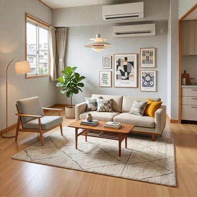
Visual weight is how "heavy" a piece feels to the eye — a function of its size, color, and how solid it looks. A dark leather sectional carries far more weight than a slim-legged armchair, even if they take up similar floor space. When all the heavy pieces cluster on one side of the room, the space feels like it's tipping over.
You don't need matching weights on both sides; you need balance, not symmetry. If a bulky sofa dominates one wall, counter it across the room with a combination of lighter pieces — a tall bookshelf, a floor lamp, a large plant, or framed art rising up the wall. Height counts too: spreading tall elements around the room (a lamp here, a plant there) keeps your eye moving instead of sinking into one corner.
Small-Room Strategies
Small spaces — studios, apartments, and first homes — reward restraint. The goal is to make the room feel bigger, and layout does most of that work for free.
- Zone a studio without walls. Use a rug, the back of a sofa, or an open shelving unit to separate "sleep," "relax," and "eat." An open bookshelf divides the room while light still passes through, so nothing feels boxed in.
- Keep sightlines low and long. Concentrate tall furniture on one wall and keep the rest low. When you can see across the room and out a window, the space reads as larger.
- Let a little floor show. Legs on sofas and chairs let the floor run underneath, which tricks the eye into seeing more space than furniture sitting flat on the ground.
- Choose double-duty pieces. A storage ottoman, a drop-leaf table, or a bed with drawers underneath earns its footprint twice.
Renting? None of this requires a single hole in the wall or a landlord conversation. For more no-damage ideas, see our renter-friendly room makeover guide.
Common Layout Mistakes to Avoid
- Pushing everything against the walls. This is the number-one giveaway of an unplanned room. Floating the seating group inward almost always looks better, even in a small space.
- A rug that's too small. A postage-stamp rug marooned in the middle of the floor makes the whole room feel cheaper. Size up so the seating group sits on it.
- Blocking the light. Don't park a tall bookcase or the back of a sofa in front of your best window. Natural light is the one thing you can't buy more of.
- Ignoring the entry sightline. Standing in the doorway, you shouldn't be greeted by the back of a sofa or a wall of clutter. Give the first glance something worth seeing — that's your focal point at work.
- Art hung too high. When in doubt, lower it. Center art around eye level and relate its width to the furniture beneath it.
Test Your Layout Risk-Free Before You Move Anything
The hardest part of layout has always been that you couldn't see the result until you'd already dragged the sofa across the room. That's changed. You can now upload one photo of your actual room and get an AI-generated redesign of the same space, arranged with these principles in mind — so you can react to a real picture instead of guessing.
It's a low-stakes way to try ideas: see whether floating the sofa opens things up, whether a larger rug pulls the room together, or how a different style reads in your space. The generated image is an AI concept, and the numbered tags on the furniture link to real products that resemble what you see — handy when you want to move from "I like this look" to "here's something similar I could actually buy." If you're new to how this works, our explainer on what AI interior design is and our note on what to expect from an AI room design set realistic expectations before you start.
For the cleanest result, photograph the whole room from a corner so the AI can read the walls, floor, and depth — see how to photograph your room for a 30-second checklist. And if you're still deciding on a look, our interior design styles guide and Japandi style guide can help you choose one that fits the layout you're building.
Try a layout on your own room
Upload one photo, pick a style, and see your room rearranged in minutes. A calm, low-clutter Scandinavian layout is a good place to start if you're testing openness and light.
Redesign my room in Scandinavian style → Six free designs to start — no sign-up required.Product links may be affiliate links; we may earn a commission at no extra cost to you. Images in this article and in the app are AI-generated concepts — linked products are real items that resemble what you see, not exact matches.